Introduction
Your resume is a static document sitting in a recruiter’s inbox, buried under hundreds of other identical PDFs. If you want to stand out in the current tech landscape, a standard text document rarely cuts it anymore. Developers need a dynamic space to display their live applications, source code, and technical writing.
Building a digital portfolio solves this issue, but choosing the wrong stack can introduce unwanted headaches. Traditional HTML and CSS projects can quickly turn into a nightmare of complex media queries. Heavy JavaScript frameworks often create slow, sluggish experiences that frustrate mobile visitors before your page even finishes loading.
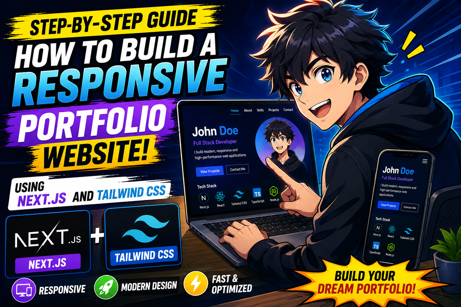
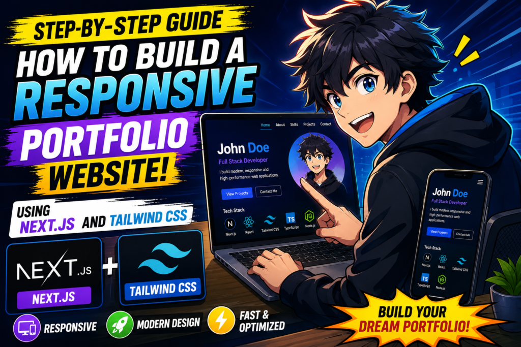
This guide focuses on constructing a lightweight, highly responsive portfolio using Next.js and Tailwind CSS. By combining these two tools, you can build a fast, search-engine-optimized site that looks seamless on both a desktop monitor and a smartphone screen.
What Is Next.js and Tailwind CSS?
Next.js is a React-based framework built by Vercel that allows developers to create production-ready web applications. Unlike standard React apps that load entirely in the user’s browser, Next.js handles the heavy lifting on the server side. This means pages render faster, helping both human users and search engine bots view your content instantly.
Tailwind CSS is a utility-first CSS framework designed to speed up user interface development. Instead of jumping back and forth between an HTML file and a separate stylesheet trying to remember class naming conventions like .portfolio-card-variant-2, you apply direct utility classes like flex, pt-4, text-center, and rounded-xl directly inside your HTML or React components.
Why People Use This Stack
Many developers abandon their portfolio projects halfway through because configuring build tools, routers, and custom CSS layouts becomes tedious. Next.js eliminates this friction by offering pre-configured routing, image optimization, and font management out of the box.
Tailwind CSS complements this setup by eliminating the need to write custom media queries. For example, if you want a text element to be small on a phone but large on a desktop screen, you simply write text-sm md:text-lg. The framework handles the layout calculations behind the scenes, keeping your codebase neat, predictable, and manageable.
Key Features of a Next.js & Tailwind Portfolio
- Server-Side Rendering (SSR) & Static Site Generation (SSG): Your portfolio pages load almost instantly because the HTML is pre-built before it reaches the user.
- Utility-First Styling: Speed up design changes by adding classes directly inside your code.
- Built-In Image Optimization: The
<Image />component automatically scales, compresses, and serves modern image formats to prevent large asset files from slowing down mobile connections. - Responsive Breakpoints: Tailwind uses simple mobile-first prefixes (
sm:,md:,lg:,xl:) to alter your design dynamically depending on the user’s screen size.
How It Works
When a user visits your portfolio website, Next.js serves a pre-rendered HTML page right away. Once that page arrives in the browser, React handles the interactive elements, such as navigation toggles or filtering project tabs.
Tailwind CSS analyzes your project files during the build phase, scans your components for any utility classes you actually used, and generates a single, highly compressed CSS file. Any classes you didn’t use are excluded from the bundle. This ensures mobile users aren’t stuck downloading massive files full of style rules your site doesn’t even use.
Practical Use Cases
Consider a freelance developer who needs to showcase their work to prospective clients. A slow-loading site built with massive images and uncompressed video assets might cause a client to close the tab before seeing the projects. Using Next.js ensures the site loads quickly even on unstable cellular networks.
Another common use case is building a technical blog alongside your portfolio. Next.js handles Markdown or MDX files efficiently, allowing you to write articles in plain text and style them automatically using Tailwind’s typography plugins.
Step-by-Step Guide to Building the Portfolio
Step 1: Initialize Your Project
Open your terminal and run the standard installation command to set up a new Next.js project. We will use the interactive command line installer to configure Tailwind CSS automatically.
Bash
npx create-next-app@latest my-portfolio
During the installation prompts, make sure to select the following options:
- Would you like to use TypeScript? Yes/No (Choose based on your preference)
- Would you like to use ESLint? Yes
- Would you like to use Tailwind CSS? Yes
- Would you like to use
src/directory? Yes - Would you like to use App Router? Yes
Once the installation finishes, navigate into your project directory and start the local development server:
Bash
cd my-portfolio
npm run dev
Step 2: Configure the Global Styles
Open the src/app/globals.css file. The installer automatically includes the Tailwind directives at the top of the file. Clean out the default boilerplate styles so your custom design can start fresh:
CSS
@tailwind base;
@tailwind components;
@tailwind utilities;

:root {
  --background: #ffffff;
  --foreground: #171717;
}

body {
  color: var(--foreground);
  background: var(--background);
  font-family: Arial, Helvetica, sans-serif;
}
Step 3: Create a Responsive Navigation Component
Create a new directory named components inside the src folder. Inside that folder, create a file named Navbar.jsx. This component will render a clean horizontal menu on desktop screens and a toggleable mobile menu on smaller viewports.
JavaScript
"use client";
import { useState } from "react";
import Link from "next/link";

export default function Navbar() {
  const [isOpen, setIsOpen] = useState(false);

  return (
    <nav className="bg-white shadow-md fixed w-full z-50 top-0 left-0">
      <div className="max-w-7xl mx-auto px-4 sm:px-6 lg:px-8">
        <div className="flex items-center justify-between h-16">
          <div className="flex-shrink-0">
            <Link href="/" className="text-xl font-bold text-blue-600">
              DevPortfolio
            </Link>
          </div>
          <div className="hidden md:block">
            <div className="ml-10 flex items-baseline space-x-4">
              <Link href="#about" className="text-gray-700 hover:text-blue-600 px-3 py-2 rounded-md font-medium">About</Link>
              <Link href="#projects" className="text-gray-700 hover:text-blue-600 px-3 py-2 rounded-md font-medium">Projects</Link>
              <Link href="#contact" className="text-gray-700 hover:text-blue-600 px-3 py-2 rounded-md font-medium">Contact</Link>
            </div>
          </div>
          <div className="md:hidden">
            <button
              onClick={() => setIsOpen(!isOpen)}
              className="inline-flex items-center justify-center p-2 rounded-md text-gray-700 hover:text-blue-600 focus:outline-none"
            >
              <svg className="h-6 w-6" fill="none" viewBox="0 0 24 24" stroke="currentColor">
                {isOpen ? (
                  <path strokeLinecap="round" strokeLinejoin="round" strokeWidth={2} d="M6 18L18 6M6 6l12 12" />
                ) : (
                  <path strokeLinecap="round" strokeLinejoin="round" strokeWidth={2} d="M4 6h16M4 12h16M4 18h16" />
                )}
              </svg>
            </button>
          </div>
        </div>
      </div>

      {isOpen && (
        <div className="md:hidden bg-white border-t">
          <div className="px-2 pt-2 pb-3 space-y-1 sm:px-3">
            <Link href="#about" onClick={() => setIsOpen(false)} className="block text-gray-700 hover:text-blue-600 px-3 py-2 rounded-md text-base font-medium">About</Link>
            <Link href="#projects" onClick={() => setIsOpen(false)} className="block text-gray-700 hover:text-blue-600 px-3 py-2 rounded-md text-base font-medium">Projects</Link>
            <Link href="#contact" onClick={() => setIsOpen(false)} className="block text-gray-700 hover:text-blue-600 px-3 py-2 rounded-md text-base font-medium">Contact</Link>
          </div>
        </div>
      )}
    </nav>
  );
}
Step 4: Build a Grid-Based Project Showcase
Create another file named ProjectGrid.jsx inside your components directory. We will use Tailwind’s CSS Grid classes to dynamically organize the layout. The component will show a single column on mobile devices, scale to two columns on tablets, and shift to three columns on wide desktop setups.
JavaScript
import Image from "next/image";

const projects = [
  {
    title: "E-Commerce Platform",
    description: "A fast online store built with Next.js and Stripe payments integrations.",
    image: "/project1.jpg",
    tags: ["Next.js", "Tailwind", "Stripe"],
  },
  {
    title: "Task Management App",
    description: "Real-time task board featuring drag-and-drop mechanics and subtask lists.",
    image: "/project2.jpg",
    tags: ["React", "Node.js", "MongoDB"],
  },
  {
    title: "Analytics Dashboard",
    description: "Clean data visualization dashboard with dark mode toggles and custom reporting charts.",
    image: "/project3.jpg",
    tags: ["Next.js", "Tailwind", "Chart.js"],
  },
];

export default function ProjectGrid() {
  return (
    <section id="projects" className="py-16 bg-gray-50">
      <div className="max-w-7xl mx-auto px-4 sm:px-6 lg:px-8">
        <h2 className="text-3xl font-extrabold text-gray-900 text-center mb-12">
          My Recent Work
        </h2>
        <div className="grid grid-cols-1 sm:grid-cols-2 lg:grid-cols-3 gap-8">
          {projects.map((project, index) => (
            <div key={index} className="bg-white rounded-lg shadow-md overflow-hidden hover:shadow-xl transition-shadow duration-300">
              <div className="relative h-48 w-full bg-gray-200">
                <div className="absolute inset-0 flex items-center justify-center text-gray-400">
                  Placeholder Image (Add custom files to public/)
                </div>
              </div>
              <div className="p-6">
                <h3 className="text-xl font-bold text-gray-900 mb-2">{project.title}</h3>
                <p className="text-gray-600 text-sm mb-4">{project.description}</p>
                <div className="flex flex-wrap gap-2">
                  {project.tags.map((tag, tIndex) => (
                    <span key={tIndex} className="bg-blue-50 text-blue-600 text-xs px-2.5 py-0.5 rounded-full font-medium">
                      {tag}
                    </span>
                  ))}
                </div>
              </div>
            </div>
          ))}
        </div>
      </div>
    </section>
  );
}
Step 5: Put Everything Together in the Page File
Open your main page file located at src/app/page.js or src/app/page.tsx and assemble the structural blocks of your portfolio app:
JavaScript
import Navbar from "@/components/Navbar";
import ProjectGrid from "@/components/ProjectGrid";

export default function Home() {
  return (
    <>
      <Navbar />
      <main className="pt-16">
        {/* Hero Section */}
        <section id="about" className="py-20 text-center bg-white px-4">
          <div className="max-w-3xl mx-auto">
            <h1 className="text-4xl sm:text-5xl md:text-6xl font-extrabold text-gray-900 tracking-tight">
              Hi, I'm a <span className="text-blue-600">Full-Stack Developer</span>
            </h1>
            <p className="mt-6 text-lg sm:text-xl text-gray-500">
              I build fast, clean, and highly intuitive web applications that work perfectly on every modern device screen.
            </p>
            <div className="mt-10 flex justify-center gap-4">
              <a href="#projects" className="bg-blue-600 text-white px-6 py-3 rounded-md font-medium hover:bg-blue-700 transition">
                View My Work
              </a>
              <a href="#contact" className="border border-gray-300 text-gray-700 px-6 py-3 rounded-md font-medium hover:bg-gray-50 transition">
                Get In Touch
              </a>
            </div>
          </div>
        </section>

        {/* Project Component Section */}
        <ProjectGrid />

        {/* Basic Contact Section */}
        <section id="contact" className="py-16 bg-white text-center px-4">
          <div className="max-w-xl mx-auto">
            <h2 className="text-3xl font-bold text-gray-900 mb-4">Let's Work Together</h2>
            <p className="text-gray-600 mb-8">
              I'm currently accepting freelance projects and full-time engineering opportunities.
            </p>
            <a href="mailto:your.email@example.com" className="bg-gray-900 text-white px-8 py-3 rounded-md font-medium hover:bg-gray-800 transition">
              Say Hello
            </a>
          </div>
        </section>
      </main>
    </>
  );
}
Benefits of Next.js and Tailwind CSS
- Rapid Iteration: Designing layout adjustments happens entirely within the component file, eliminating the step of configuring separate style documents.
- Minimized Build Sizes: The compilation stage drops unused rules automatically, producing lean CSS files for efficient network transfers.
- SEO Advantages: Pre-rendered markup structures mean site crawlers can read layout contents without executing deep client-side logic scripts.
Limitations to Consider
While this combination works incredibly well for most web projects, it may not fit every single scenario perfectly. If you are constructing a very basic, single-page landing portfolio with only text and no interactive components, running a full React framework might add unnecessary structural bulk. In those simpler cases, basic HTML combined with vanilla CSS can achieve highly efficient loading results without complex system setups.
Additionally, Tailwind’s inline approach means your code syntax can look cluttered if you string together dozens of complex utility design rules inside a single component class parameter.
Pros and Cons Table
| Pros | Cons |
|---|---|
| Fast rendering and quick structural page switching. | Inline class lists can make component markup look cluttered. |
| Automatic layout adjustments via utility modifiers. | Requires familiarity with Node runtime utilities and build chains. |
| Shrinks style asset sizes by dropping unused classes. | Can be excessive for simple, static text resumes. |
Best Alternatives
- Astro + Tailwind CSS: An excellent alternative framework option if you want to avoid loading client-side JavaScript entirely for completely static presentation content.
- Gatsby + Styled Components: A solid choice if you prefer using traditional CSS syntax or component styles rather than inline class utilities.
- Hugo or Jekyll: Great options if you want a simple portfolio engine that generates straight HTML layout files out of Markdown folders.
Common Mistakes Users Make
- Mixing Breakpoint Strategies: Using different responsive prefixes interchangeably throughout your components can break your layout logic. It’s best to stick to Tailwind’s mobile-first framework default, where standard styles target small devices and prefixes like
md:add rules for desktop views. - Leaving Unoptimized Assets in the Public Folder: Using raw smartphone photos or uncompressed assets inside project layouts will slow down performance. Pass asset sources through the standard
<Image />tags to let the system scale file formats efficiently. - Overcomplicating Layout Trees: Avoid wrapping simple text strings inside four or five separate div tags. Keep your layout tree flat to make troubleshooting layout errors easier.
Frequently Asked Questions
Do I need to buy a paid license to use Next.js or Tailwind CSS?
No, both tools are open-source and entirely free to use under the MIT license for personal and commercial projects.
Is Next.js too heavy for a simple portfolio?
For complex single-page apps, it is perfect. However, if your target page only features text lines without UI transitions, a basic HTML layout might run faster.
Can I build dark mode layouts using Tailwind?
Yes. You can prepend the dark: utility flag directly to your style strings (bg-white dark:bg-black) to configure layout appearances based on device settings.
How do I deploy this type of website online?
The easiest option is connecting your source repository directly to the Vercel platform for automated production builds.
Will search engines read the content inside my React components?
Yes. Next.js processes structural text into plain HTML strings before delivery, ensuring search crawlers read layout contents easily.
Can I include standard CSS files if I need to?
Yes. You can import traditional global or scoped CSS files alongside Tailwind utility declarations without system compatibility errors.
What is the difference between create-next-app and standard React apps?
Next.js provides built-in server rendering and page routing structures out of the box, whereas standard React apps need manual router configuration.
How do I use custom typography fonts?
You can import your preferred typography assets inside your layout using the next/font module to prevent layout shifts.
Does Tailwind slow down browser performance?
No. The build phase removes unused classes, keeping stylesheet assets compact and efficient.
Can I add animation systems to this stack?
Yes. You can use packages like Framer Motion or transition utilities inside Tailwind to configure smooth interface animations.
Final Thoughts
Building your portfolio using Next.js and Tailwind CSS is a smart move if you want a fast, modern site that handles screen adjustments cleanly. It is an ideal stack for engineers who value clean performance metrics and rapid styling development cycles.
However, if you just need a quick, text-only project grid or a basic online resume, setting up this environment might be overkill. A simple HTML page with basic CSS styles would be much faster to build and maintain. Assess your project goals first, and choose the tools that give you the right balance of performance and flexibility.